Orlando Branding Agency
Design (in all of its’ forms) is about innovation and change to connect with the users, so they feel compelled to engage with your product or even make a purchase. Thus, revising, tweaking and improving a business’ brand is necessary to keep that connection with clients and even make new ones. This process is known as rebranding as it is often used to communicate how a business has evolved.
Rebranding frequently happens when a business gets a new CEO, acquires another company, expands its’ services or its’ logo and corporate identity become outdated among new trends. As rebranding has many benefits and it is key to stay ahead of the competitors, many major companies rebranded this past 2018. Here’s a list of our favorite ones!
2018 Best Logo Design & Rebranding
1. Century 21
This real estate giant gave its’ brand a revamp by keeping their well known gold and black palette, while also embracing new graphics.

2. Bank of America
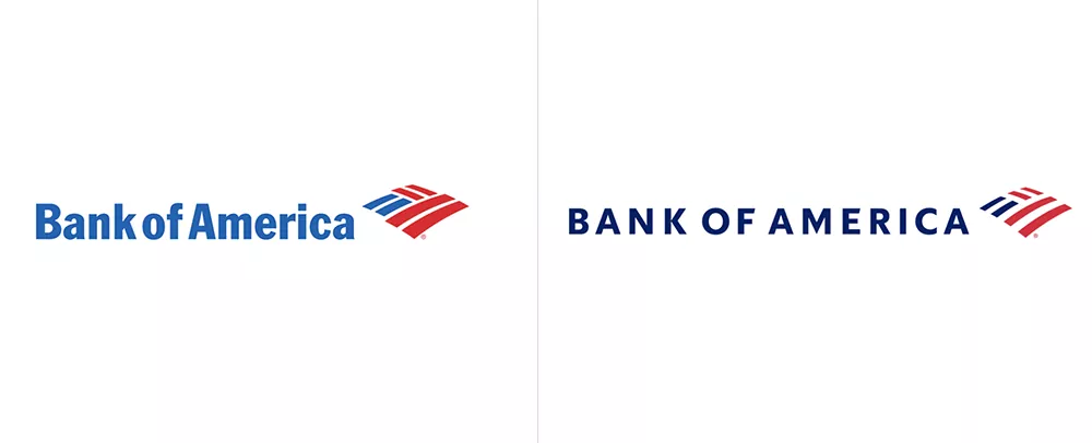
The Flagscape logo was rebranded for the first time since being introduced in 1998. It shows a more modern brand with a new font and color palette.
3. Diet Coke
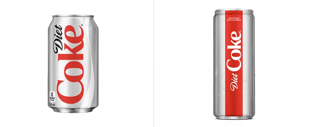
The Diet coke can was redesigned to feature a fresher look with a simplified color palette focused on silver and red with accents of bold color while still remaining faithful to the Coke classical aesthetic with the cursive font.
4.Dunkin’
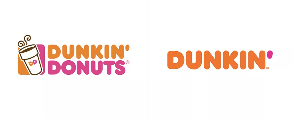
This breakfast and coffee chain simplified the look of its’ entire branding identity. According to Dunkin’s press released, the company decided to do rebrand to convey the company’s mission to serving great coffee fast.
5.Mailchimp
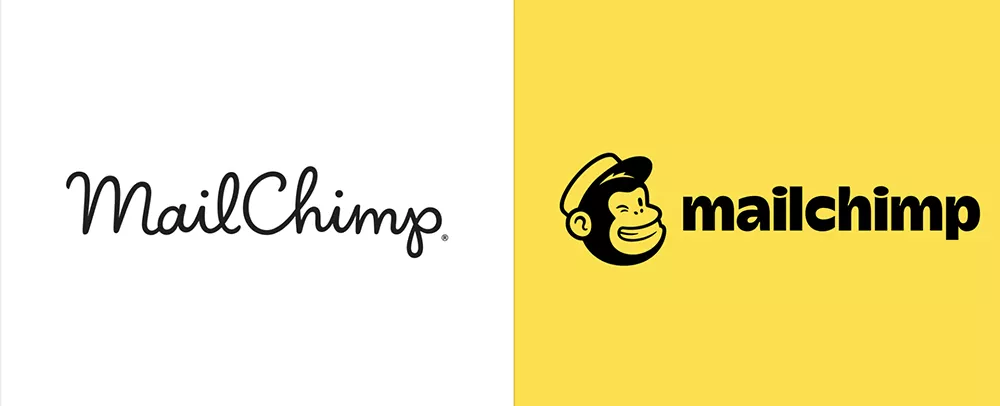
Mailchimp is an email marketing company with an unique brand in the industry. In 2018, however, its’ logo was completely rebranded, by adopting a chimp and a heavier font and abandoning its’ cursive font.
6.Burberry
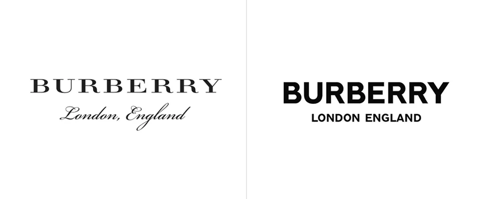
The British Brand decided to completely rebrand its’ logo this past 2018, by abandoning the traditional Bodoni font that clearly represented the brand in the fashion industry.
7.American Express
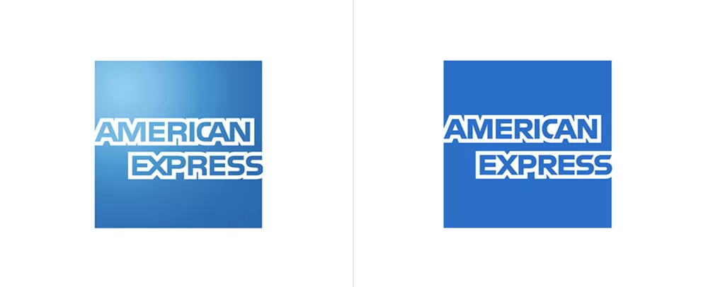
Although the rebrand might not be obvious or extreme, it still represents the business’ intent to join the current minimalistic trend in design.
8.Best Buy
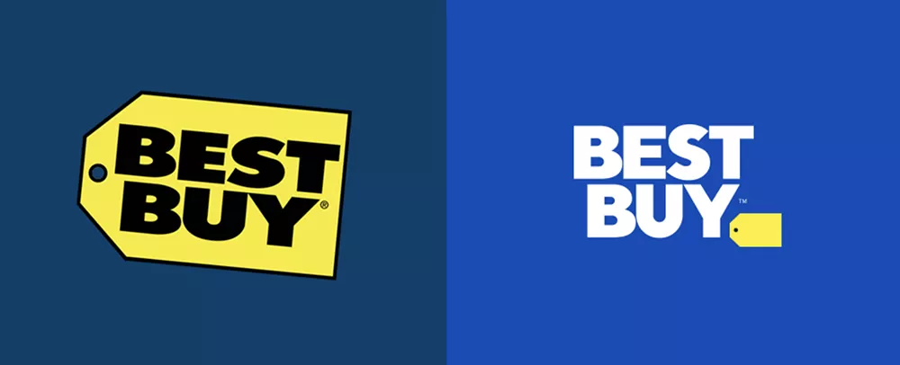
A major retailer in the United States, Canada and Mexico, Best Buy updated their brand with a new set of colors, photography and conversational language.
9.Uber
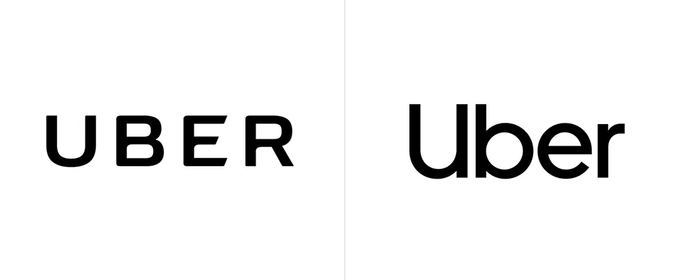
This first ride-share and ride-hail company aimed for a more approachable and easy to read brand while still maintaining its’ brand integrity.
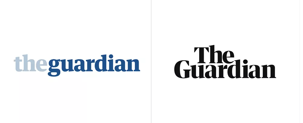
10.The Guardian
A renowned British newspaper with an amazing amount of readers, introduced its’ own font as part of the rebranding process, and it has lost its’ characteristic blue palette to embrace a more serious tone.
Rebranding has multiple benefits and, it is a process that ultimately aims to attract and retain customers. If your business has been evolving or going through a rough patch lately, we strongly recommend considering to rebrand.
Orlando Branding Agency
If you want to get ahead of you competitors with rebranding, contact us! We are an Orlando Branding & Web Design company dedicated to helping Central Florida businesses grow and expand.


