What is responsive web design?
Responsive web design responds to the user’s behavior and environment based on screen size, platform and orientation. It consists of a mix of fluid grids and layouts, responsive images and CSS media queries.
1. Turning On Responsive Features
1. Download bootstrap-responsive.css
2. Include the code below within the <head> of the document:
<meta name="viewport" content="width=device-width, initial-scale=1.0">
<link href="css/bootstrap-responsive.css" rel="stylesheet">
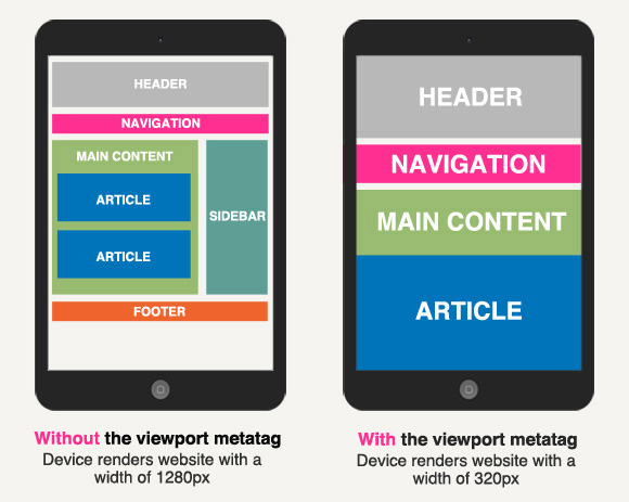
The first line of code is the viewport metatag. In mobile devices it makes the browser use the real size of the device. This way a device with a width of 320px will not display a website like a device with a width of 1280px.
The second line of code is a link to bootstrap-responsive.css.
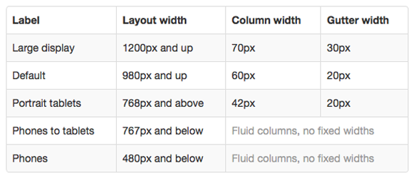
2. Understanding Bootstrap’s Grid
The default Bootstrap grid system utilizes 12 columns, making for a 940px wide container without responsive features enabled. With the responsive CSS file added, the grid adapts to be 724px and 1170px wide depending on your viewport. Below 767px viewports, the columns become fluid and stack vertically.
On the graphic below you can see that a fluid grid use percents instead of pixels for column widths. In a fluid grid, the addition of all the columns widths and the gutter should be 100%.

Adding a Container, Rows and Columns
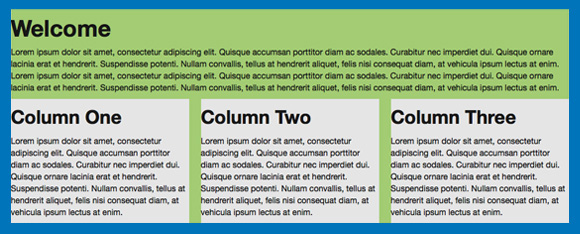
To create a layout like this:
You must add the following tags and classes:
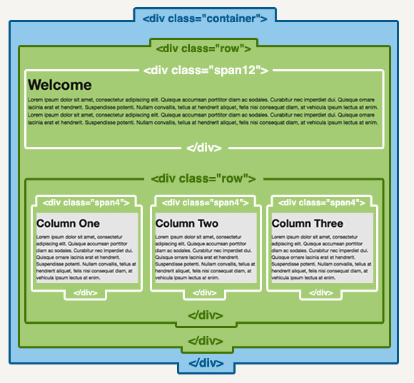
<div class="container">
    <div class="row">
        <div class="span12">

             Welcome Text

            <div class="row">
                  <div class="span4"> Column One</div>
                  <div class="span4"> Column One</div>
                  <div class="span4"> Column One</div>
             </div>

        </div><!-- Span 12 ends -->
    </div><!-- Row Ends -->
</div><!-- Container Ends -->
3. Bootstrap’s Media Queries
Media queries allow for custom CSS based on a number of conditions (ratios, widths, display type, etc) but usually focuses around min-width and max-width.
Without media queries, fluid layouts would struggle to adapt to the array of screen sizes on the hundreds of existing devices.
Bootstrap’s Media Queries:
- Modify the width of column in our grid
- Stack elements instead of float wherever necessary
- Resize headings and text to be more appropriate for devices
Supported devices
CSS3 Media Queries:
 /* Large desktop */
@media (min-width: 1200px) { ... }

/* Portrait tablet to landscape and desktop */
@media (min-width: 768px) and (max-width: 979px) { ... }

/* Landscape phone to portrait tablet */
@media (max-width: 767px) { ... }

/* Landscape phones and down */
 @media (max-width: 480px) { ... }
Example:
To change the background color of a website to red only on devices with a max-width of 767px use the code:
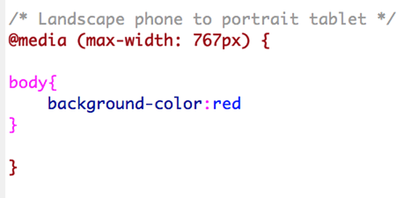
Note how 2 sets of curly braces are necessary (maroon and pink). When working with media queries extra caution is necessary to properly close the curly braces of the queries and of the styles.
IE 8 and below do not support CSS3 media queries:
For IE 8 and below that do not support media queries and/or HTML5 use the code below in between the <head> tags:
<!-- html5.js & media-queries.js (fallback) -->
<!--[if lt IE 9]>
<script src="https://html5shim.googlecode.com/svn/trunk/html5.js"></script>
<script src="https://css3-mediaqueries-js.googlecode.com/svn/trunk/css3-mediaqueries.js"></script>
<![endif]-->
A JavaScript library that supports the full range of media queries introduced in CSS3.
A fast & lightweight (only 3kb minified) polyfill for min/max-width CSS3 Media Queries (for IE 6-8, and more).
4. Flexible images
In responsive web design you can make the image auto resize to the max width of the boundary by using max-width:100% and height:auto.
img {
	max-width: 100%;
	height: auto;
    }
Bootstrap will automatically resize an image if it is wrapped within a <div> tag with a class “span1” through “span12”.
Image without a span wrap, just floated left in a viewport of 800px. It doesn’t resize:
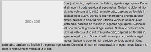
<div class="span12">
<img src="images/320.png" class="pull-left"/>
Cras justo odio, dapibus ac facilisis in, egestas eget quam.
</div>
Image wrapped in a “span3” and text wrapped in a “span9” in a viewport of 800px. It resizes:
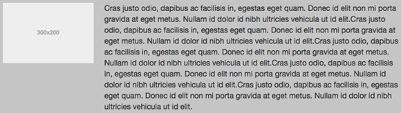
<div class="span3">
<img src="images/320.png"/>
</div>
<div class="span9">
Cras justo odio, dapibus ac facilisis in, egestas eget quam.
</div>
Using custom classes to resize images in Bootsrap:
If you need the text to wrap the image but the image to be responsive you can use custom classes.
Image without a span wrap, floated left and with a custom class in a viewport of 800px. It resizes:
<div class="span12">
<img src="images/portfolio/320.png" class="pull-left myclass"/>
Cras justo odio, dapibus ac facilisis in, egestas eget quam.
</div>
Then set the width of the image in percents
.myclass {
    width:20%
}
5. Responsive Classes
Bootstrap comes with 6 ready-to-use classes to show and hide elements in desktop, tablets and phones:
| Class | Phones 767px and below | Tablets 979px to 768px | Desktops Default |
|---|---|---|---|
.visible-phone |
Visible | Hidden | Hidden |
.visible-tablet |
Hidden | Visible | Hidden |
.visible-desktop |
Hidden | Hidden | Visible |
.hidden-phone |
Hidden | Visible | Visible |
.hidden-tablet |
Visible | Hidden | Visible |
.hidden-desktop |
Visible | Visible | Hidden |
6. Relative Margins and Padding
If you need to add margins or padding to any element in responsive web design do not use a fixed pixel value, use percents instead.

<div class="span12">
<img src="images/portfolio/320.png" class="pull-left myclass"/>
Cras justo odio, dapibus ac facilisis in, egestas eget quam.
</div>
.myclass {
    width:30%;
    margin: 0 2% 2% 2%;
}


