Orlando Web Design
Building websites for users with a wide range of abilities is imperative to make cyberspaces inclusive. Although there are many ways to approach web accessibility, we would like to focus on how to ensure your website is accessible in terms of colors as this affects users who are color blind, or who have any other form of vision impairment.
How Do I know My Website’s Color Palette is Accessible?
1. Use of Color
Colors are used in web design for not only aesthetic purposes, but also to help users navigate the site smoothly. For instance, red is used to indicate required fields in contact forms, and light blue is used to indicate links.
Depending on the content that you have on your website, the use of color will vary. We recommend being wary of using color when listing important information on a website since if it is not done properly, it can be easily missed by users. However, if you decide to do so, the Web Content Accessibility Guidelines by the W3C, suggest you check for the following points:
- Check the information conveyed by color differences is also in text.
- Include text cues for colored form control labels.
- Include visual cues(different fonts, arrows, animations, etc) when text color differences are used to convey information.
If, on the other hand, you are using color within an image to convey information, the W3C recommends you take the following steps to ensure the content is accessible:
- Make sure the information conveyed by color differences is also in text.
- Use color and patterns, such as arrows, dotted lines, or circles.
2. Use of Contrast
Contrast is essential in readability and usability. Make sure your website meets the following accessibility standards:
- Ensure the use of contrast when using links. In the W3C guidelines, this is done by establishing a contrast ratio of 3:1, which refers to the contrast between a link and the words around it. Here’s an example of color used to create contrast:

- You can use this Color Contrast Checker to make sure your site meets the 4.5:1 ratio as a minimum. This tool even includes explanations of the contrast ratios. Take look at the image below.

- Link accessibility can also be accomplished by including other visual cues such as underlines or change of font when hovering over the links.
Resources to Check for Accessibility
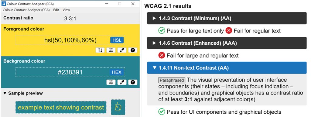
Although coding knowledge is required to make a website compliant with accessibility resources, there are plenty of easy-to-use and free tools available to help you assess your website such as this Colour Contrast Analyzer, which helps you test for not only text contrast but visual elements as well. Here’s an example of what this tool can do:
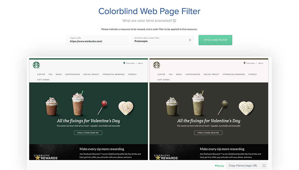
In addition, this Color Blind Filter helps you visualize your website through the eyes of someone with colorblindness.
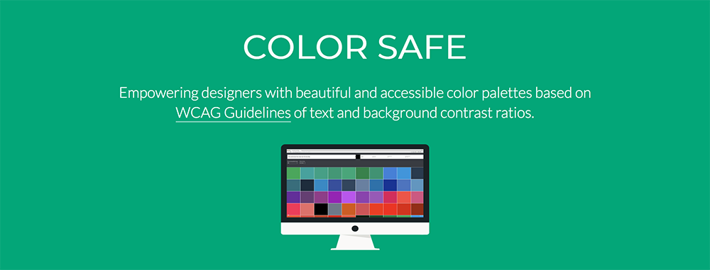
Lastly, check out Color Safe, a tool that tells you the contrast ratio as you create the palette. The images below show how it looks when you get a ratio above and below the W3C guidelines.


Orlando Web Design Company
If you need help making your website color accessible , contact us! We are an experienced Orlando Web Design company and we can help you ensure every user can easily access your web content


