Orlando Web Design
Colors communicate more than you might think. In branding, colors are used to communicate the purpose of a business, and to appeal to specific businesses. Do not believe us? Look around! Business everywhere use colors to their advantage. As blues convey peace and tranquility, banks and insurance companies tend to use them. Good examples of these are Chase Bank or Progressive Insurance. However, this goes beyond logos. It applies to websites as well, so keep reading for a guide on how to choose the correct colors for your website.
What do colors mean in Web Design?
Even though each color is different, there are some general guidelines on what warm, cool and neutral colors convey.
1. Warm Colors
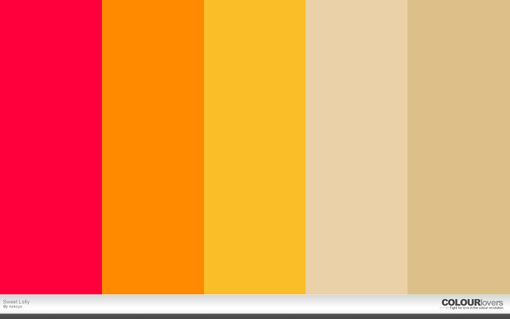
As we know these include yellows, reds and oranges. And, they usually have an energetic effect on users. If used alone, these can overstimulate visitors, just imagine how you would feel going into a completely red room; that is how your site visitors would feel when visiting a website that is all red.
Here is an example of a warm color palette with neutral colors.
2. Cool Colors
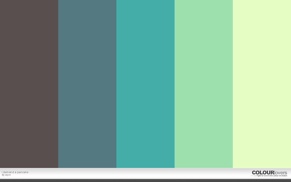
These are blues, greens and purples, and, as I mentioned before, these colors have a calming effect on viewers.
3. Neutral Colors
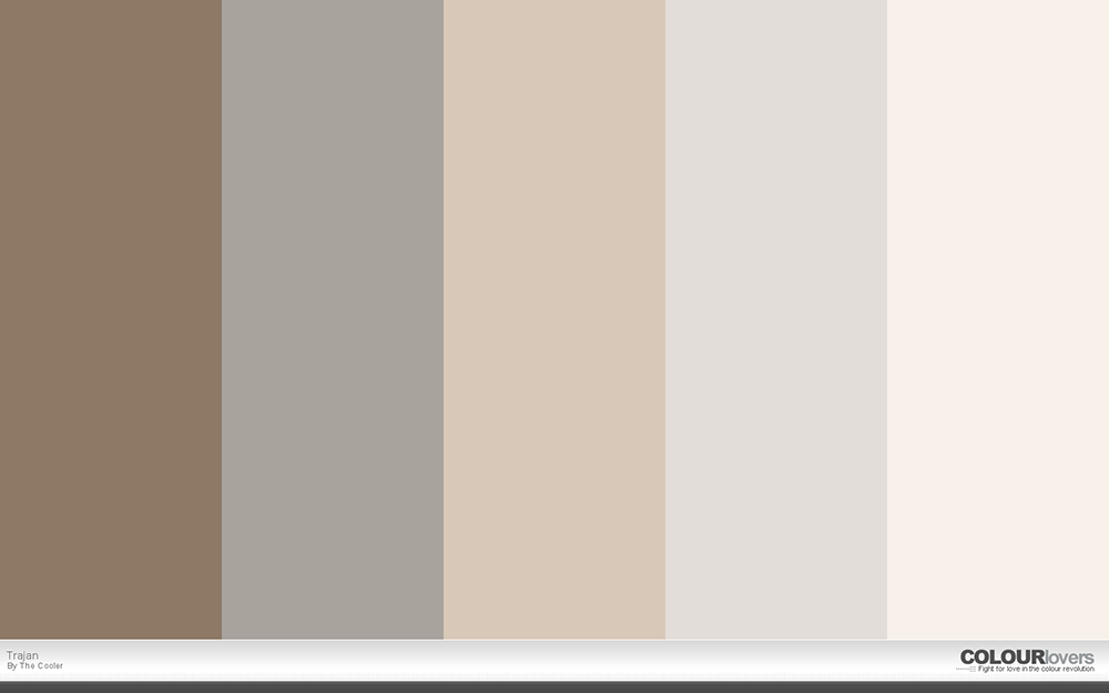
These colors are usually used to balanced or tone down warm or cool colors. Some of these colors are grays, blacks, and browns. Take a look at the example below as it encompasses shades of brown and gray.
Colors by Industry
As we mentioned previously, color palettes also vary by industry. For example, restaurants tend to use color palettes that include browns, reds, blacks and whites. This tendency is due to the fact that browns and reds often appear in meals and blacks and whites are used as backgrounds in food photography.

The Health Industry, on the other hand, leans more towards blues. Take a look below at the websites from leading businesses in the industry.

Green, is usually associated with nature. Thus, the whole foods website aims to incorporate that theme into their brand and website.

How to Choose Colors For Your Website
Now that you have a basic idea of how color psychology works, you can start thinking about the palette color for your own website. We recommend you take into account the following points:
- In general, the website’s aesthetic and color palette should align with your whole brand identity so that your customers are able to recognize it.
- The industry of your business or product.
- A good number of colors for your website is 3. This is a good number as it allows to create balance in the website.
- Websites should be accessible to all users. Some users are color blind, so it is important to create a color palette that creates enough contrast for them to clearly differentiate between background and text, or the background and image. Luckily, there are many tools out there to help you test how accessible your website is; we recommend WebAIM.
- Work with the images you have chosen to add in your website. You can generate a color palette from the images, or take a look at how those images will work with the colors you choose.
Ask yourself: “How do you want your site visitors to feel when going to your website?” and keep the points above in mind. This will help you choose a color palette that resonates with yourself, your employees and your targeted audience.
Lastly, if you would like to know what colors work well together, we recommend using color palette generators such as Colour Lovers, Adobe Kuler, or Design Seeds.
Orlando Web Design Company
If your business needs a professional website, contact us now for a free quote! We are an Orlando Web Design company dedicated to helping Central Florida businesses create websites that generates more sales.


